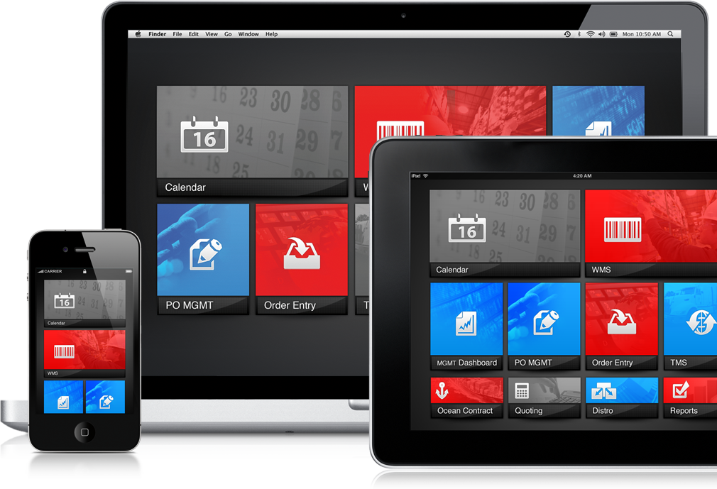
home facebook instagram youtube search home2 vk share-alt home-outline twitter odnoklassniki

SEKO Logistics

Seko is the leading provider of supply chain management services, including customizable IT solutions for transportation, logistics and warehousing.

The Challenge

Our challenge was to advance and simplify SEKO’s cloud-based logistics solution while allowing room for future product enhancements.

Having worked with Seko for years, we were excited
about this opprotunity to merge innovation and design.

MySEKO's Fav 5

We created and branded the Fav 5 widget set. When users log in to the MySEKO portal, they can now go straight to their most frequently used functions, from quoting to shipping.

A Cleaner Dashboard

We stripped the product down to its core and created a simple grid with graphic buttons to easily access the suite of services. We also introduced features like anchored scrolling so that important information could always remain on the screen.

A Stronger Brand

We incorporated the SEKO visual brand across the product, adding new elements and refreshing others. As a result, the interface is both re-imagined and consistent with the SEKO brand—and it is now used in all corporate video presentations.

Typefaces

Two typefaces were chosen to help SEKO communicate clearly and consistently with its customers.


Helvetica Neue Medium

Myriad Pro Bold

The End Result

Customer usage of statistical data on MySEKO has increased, and overall awareness of the SEKO brand has shown a marked improvement as a result of this project and others in this longtime partnership.